Conducting a customer retention analysis is much more than calculating the churn rate. To get a clear picture, you need to figure out where, how, and why your customers leave. The MRR Cohorts report allows you to track the behaviour of your customers over time, by grouping customers into buckets, or, cohorts, based on the month they sign up. By following the customer data over months, you can begin to understand the different experiences your customers may have and gain new insights into where your product might be succeeding - or failing.
How to read the MRR Cohorts Report
Each month (see the furthest left column) is its own cohort. The second column from the left represents the value that cohort is comprised of, either in terms of Revenue, or number of customers.
Let's start with customers - say you have 11 customers sign up in May 2021. By scanning to the right on the same row, you can see what happens to those 11 customers.
See example below:
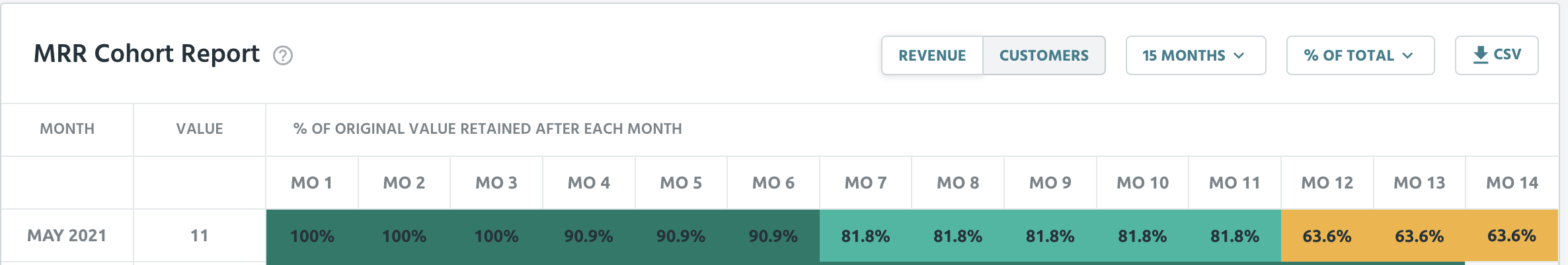
In months 1, 2, and 3, (that would be May, June, July) you kept all of your customers, no one churned. But in month 4, out of that original 100%, you’re now down to 90.9%. And by month 12, May 2022, only 63.6% of the original cohort remains. By using the button second from the left, you can toggle between showing the value as a % of total, % of previous, or total value. Let’s try total value, i.e. number of customers.
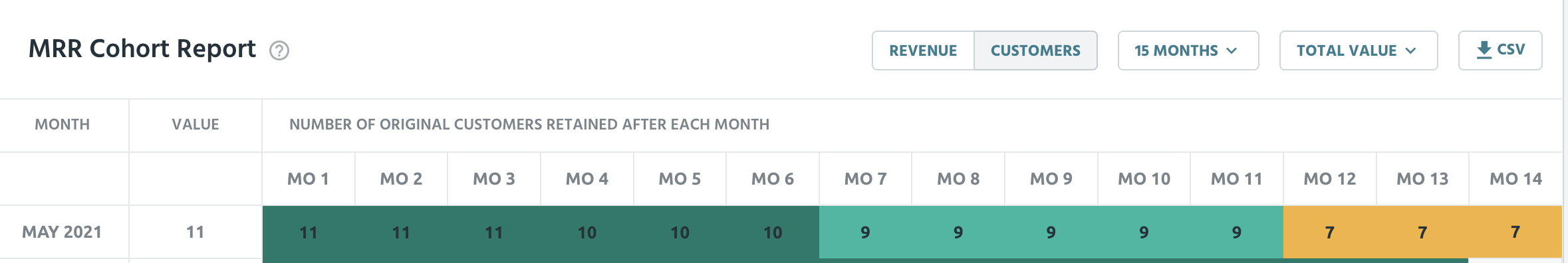
Same data, but the table shows the actual number of customers, instead of a percentage.
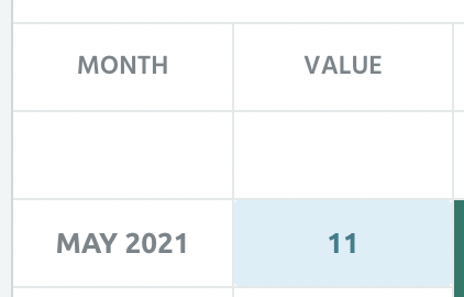
You can also see which customers specifically comprise that cohort, by clicking on the value. This will take you to that cohort in your customers tab.
We can also look at the cohort represented by revenue, instead of customers, by clicking on the revenue tab.
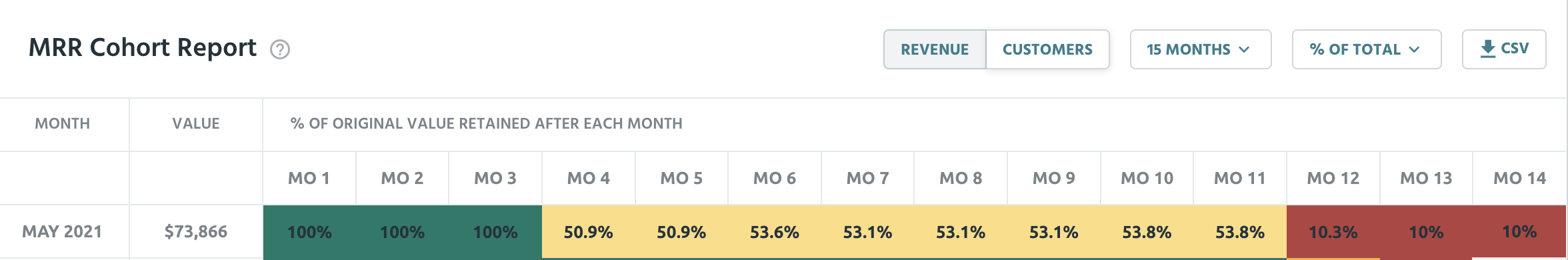
As you can see from the colour coded cells, the revenue tab tells a different story to the customer tab. While the customer tab might have you believe that for the first 6 months, business is going great and you only lost 1 customer, by month 4 you’ve actually lost almost 50% of your MRR. That’s because some customers might be on a cheaper plan, and whoever you lost in month 4 was a whale. Similarly, by one year in you might think that, having kept onto 63% of your customer base in that cohort, you’re doing okay - but that 63% accounts for only 10% of your revenue. Reading the revenue tab is really important as it helps you contextualise your data, and is a more direct indicator of your company’s health - your revenue.
One important detail to note, when comparing the customer and revenue views: while the % retained by revenue can increase each month, or exceed 100%, the % retained by customers cannot. This makes sense because while existing customers can upgrade their plan as well as downgrade, any new customers would be counted in a different cohort. In the example above, between month 5 and 6 the number of customers was the same, but due to an upgrade, the revenue increased from 50.9% to 53.6% of the original value.
The cohort report is not only useful read horizontally, but vertically as well. Reading the cohort vertically can help answer questions such as “Is my month 6 retention improving over time?” and “Are we getting better or worse as time goes on?”
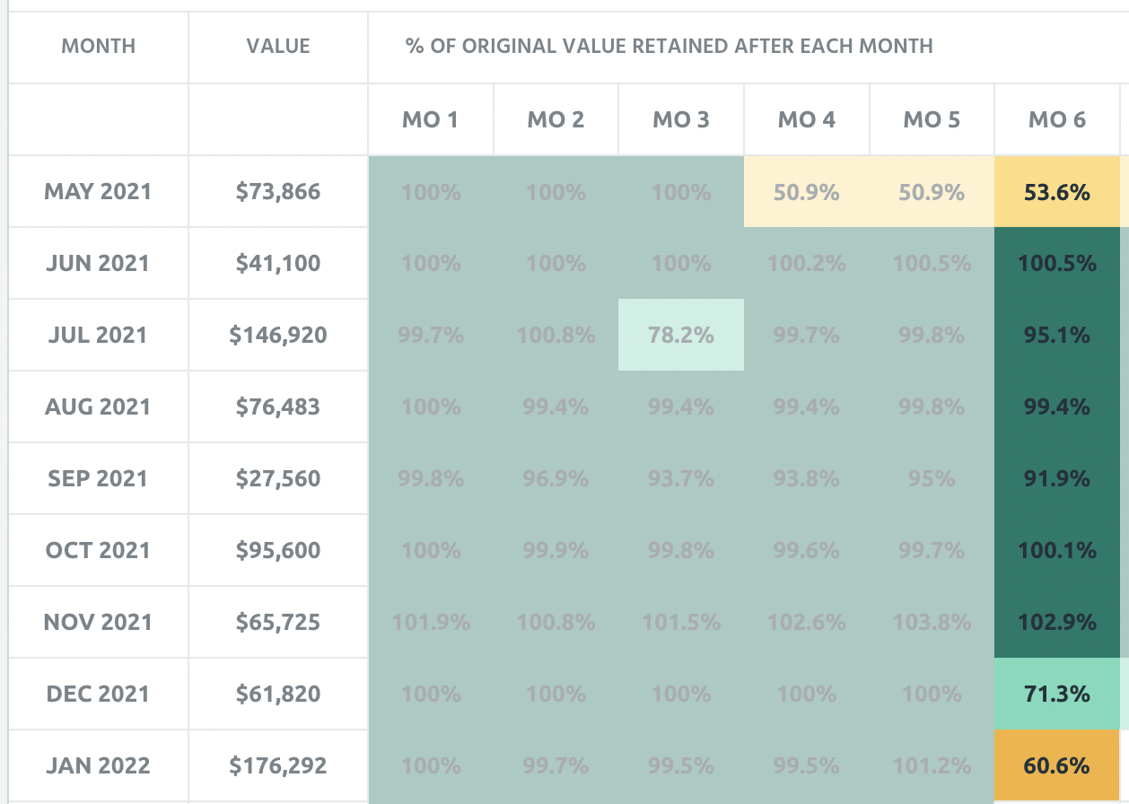
In the above dataset, by reading vertically we notice that the cohorts starting in December 2021 and January 2022 have significantly worse month 6 performance than cohorts that started before that. Perhaps something happened in December that could be worth looking into.
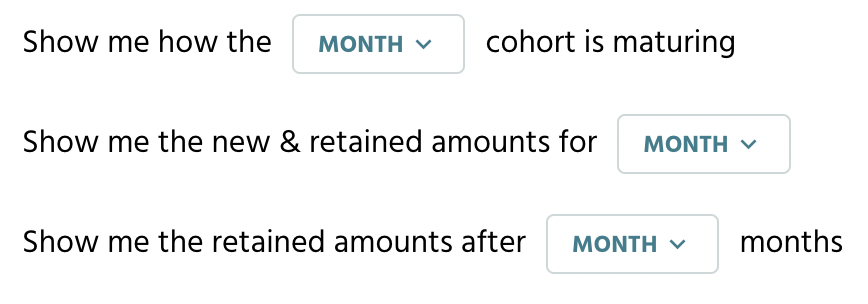
Pro tip: you can isolate certain cohorts or months like in the image above, by setting filters in the “show me retained amounts in x month” buttons at the bottom of the chart.
What can we learn from the Cohorts Report
So you now know how to read the Cohorts Report. Great! So what can we actually do with this information? Let’s start with the obvious, once again referring to the same data set as before:

In month 3, your revenue went from 100% to 50%. Especially if this holds true for all of the cohorts following May 2021, this could mean that your customers don’t see value in your product after the third month. You can use this information to focus on that third month experience for your customers, and see if there is something to improve there. Similarly, the drop off from month 11 to one year could be worth investigating.
The difference between revenue retained and customers retained can tell an interesting story. Lets say your revenue retention for a given month is 90%, but your customer retention is 60%. Looks like your more expensive customers tend to stick around — or, your lower priced customers churn at a higher rate. Consider the inverse, where your revenue retention is 60%, but your customer retention is 90%. In this case, your lower paying customers seem plenty happy to stick with your product, but you’ve lost more of your more expensive customers. What can you do to fix this?
The Cohorts Report is a really powerful tool, and it’s not just good at telling you that a lot of customers churn after one year. Take a look, poke around, see what patterns emerge. And if you have any questions, feel free to reach out at product@profitwell.com.